WYSIWYG View
See also: Outline View, Form Editor, Controls, How Style Is Applied
Introduction
The WYSIWYG View is designed to be used in conjunction with the Outline View. Each page consists of a number of controls organised in a tree-like structure. The WYSIWYG View shows a page as it will appear in a browser, whereas the Outline View shows the controls as a tree hierarchy. So both of these panels show alternate views of the same underlying controls. Most editing functions are available from both panels.
WARNING! the system renders the page as XHTML in the WYSIWYG View, and not all HTML content is considered valid within the XHTML standard. This can sometimes cause unexpected results when HTML content is added to a page. Click here for further information.
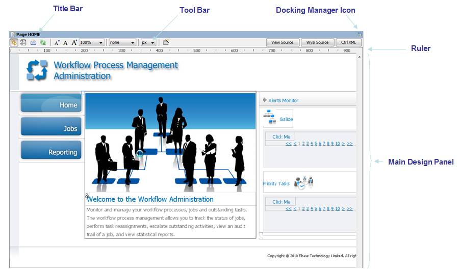
Title Bar
This shows the name of the page being edited. On the far
right-hand side, the docking manager icon  gives
access to the docking and frame management
functions.
gives
access to the docking and frame management
functions.
Double clicking on the title bar maximizes the display of the WYSIWYG View; double-clicking again returns the view to its previous size.
Tool Bar
|
|
|
This toggle switch controls synchronization with the Outline View. When synchronized, a control selected in either view is highlighted in both views; when unsynchronized, each view works independently. |
|
|
This toggle switch can be used to remove any designer aids inserted by the system; this causes the page to display as true WYSIWYG - exactly the same as it will be shown in a browser. When selected, the following are removed:
|
|
|
|
|
This toggle button switches between the normal web design view and the print design view. Print design view provides additional facilities for designing print pages. Click here for details. |
|
|
|
Refreshes the WYSIWYG View. |
|
Font Size
Control – the following three icons adjust the size
of the font shown in the design panel for all texts; they do not have any
effect on the size of non-text items. |
||
|
|
|
Decreases the font size |
|
|
|
Resets the font size |
|
|
|
Increases the font size |
|
|
adjusts the size of all page content including both text and non-text items. Can have the following values: |
|
|
·
Full
Width |
Adjusts the size of content in conjunction with the screen size control. When the screen size is set to an explicit value (anything other than none), then full width will adjust the size of content to fit the selected screen size. When screen size is set to none, a setting of full width has no effect. |
|
|
·
nn% |
Zooms by the specified amount. Zoom values can be maintained in Designer Preferences. |
|
|
|
||
|
· none |
No window dimension size is set – the page is rendered using the actual width of the WYSIWYG panel at any given moment e.g. if the actual screen width is 750px the output page will be rendered treating this value as 100%. This produces the same result as adjusting a browser window size. |
|
|
· mmm x nnn |
When an window dimension size is selected, the system displays dotted lines indicating the selected dimensions, and the system will render the page using the selected width. On some occasions, content will appear beyond the dotted vertical width line e.g. the page contains a field control with a large display length. This is equivalent to a horizontal scrollbar within a browser. When an explicit window dimension is selected, zoom control should be set initially to 100%. Window dimension values can be maintained in Designer Preferences. |
|
|
|
select a size unit from the dropdown list. This size unit will then be displayed in the ruler. |
|
|
|
Fields Wizard: supports the creation of multiple fields and field controls. |
|
|
|
|
|
|
View Source |
Displays the XHTML source used to generate the page. Note that in the designer environment, this source contains additional tags used to control the designer environment. |
|
Ruler
The Ruler provides a measure of window width in the selected size units.
Help
The help key F1 displays help for the currently selected control at any point.
Main Design Panel
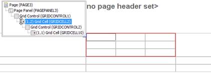
Identifying Controls
All container controls are surrounded by a thin grey border to help clarify where one control ends and the next begins. As the mouse is moved over any given control, a black dotted border is drawn identifying the bounds of the control. When a control is hidden, it is greyed out.
Selecting Controls
When the mouse is clicked over a control, the underlying control is selected: it is highlighted with a light blue background and given a dark blue border. Also, for container controls and certain other controls, a yellow identification bar is shown above the control. This yellow bar may be followed by a control widget (for controls that support widgets).
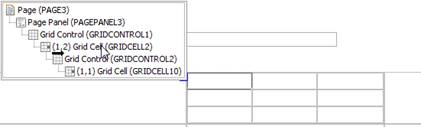
In addition, as the mouse is moved over a control, a small blue box appears at the top left of its occupied space; this is to help in the situation where many controls are very close together and therefore difficult to select. Moving the mouse over this blue box pops up a tree showing all parent controls; moving the mouse over the controls in the tree highlights the underlying control with a red border as a further aid to identification, and clicking a control in the tree selects the control.
Multiple controls can be selected by holding down the Ctrl key and left clicking on the controls. A range of controls can be selected by holding down the Shift key.
Control Widgets
A control widget is an additional item added to the WYSIWYG View for certain controls, and is shown when the control is selected in the WYSIWYG View. These widgets are shown above the control they represent as a bar with a light yellow background as shown below (for a group panel control):
Control widgets provide specific designer functionality for the control they represent – usually this is some sort of width adjustment. See the documentation for each control for more information on control widgets. Control widgets exist only within the WYSIWYG View and play no role at runtime.
Adding Controls
Controls can be added to a page in a number of ways:
- By dragging items from one of the other view panels (see also Drag And Drop). The following are supported:
· Dragging any control from the Palette View. Note that for field and table controls, this will also create a new field or table respectively.
· Dragging one or more fields from the Fields View
· Dragging one or more tables or table columns from the Tables View
Drop locations are shown as either a vertical or horizontal black line depending on the layout in use for the target drop control.
- Via right click.
- By
clicking on the fields wizard
 (shortcut
Alt Ctrl W) on the toolbar (this supports the creation of new fields and field controls)
(shortcut
Alt Ctrl W) on the toolbar (this supports the creation of new fields and field controls)
When a new control is added, its properties are shown in the Properties View.
Drag And Drop
Controls can be moved by dragging: either within the WYSIWYG View, within the Outline View, or between these two views. Drop locations are shown as either a vertical or horizontal black line dependent of the layout in use for the target drop control.
In addition, as the mouse is moved over each control, a small blue box appears at the top left of its occupied space; this is to help in the situation where many controls are very close together and therefore the exact drop location can be difficult to select. Moving the mouse over this blue box pops up a tree showing all parent controls; the drop location is shown as a black line either under the icon for the control – signifying drop after the control, or a little to the right – signifying drop inside the control.
Deleting Controls
Controls are deleted by first selecting them, then either:
- Pressing the Delete key
- Right clicking and selecting Delete control(s)
Right Click Functionality
Right clicking on a control shows the right click menu.
Editing Texts
Double clicking on any text shows the text editing dialog which supports:
- Changing the text
- Choosing another form/component text or a shared text
- Maintaining language texts
- Indicating that the text contains formatting HTML
See Working With Texts.